L
E
X
T
R
O
C
H
U
T
About Alex Trochut
Introduction
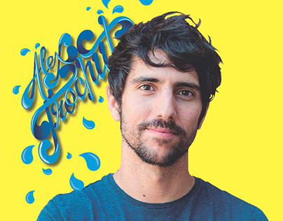
Alex Trochut is a Barcelona-born typographer, graphic designer, and illustrator who redefined the boundaries between written language and visual art. Born in 1981, he rose to prominence through his radical approach to expressive lettering, making waves in both commercial design and experimental typography. Trochut’s visual identity is bold, textural, and emotionally evocative. His work has appeared in global campaigns and galleries alike, blurring the lines between art, design, and language. Known for mixing digital precision with analog soul, he crafts pieces where the message is inseparable from its form—a hallmark of his design philosophy. He has worked with brands and clients around the world, including Coca-Cola, The New York Times, Adobe, and the Rolling Stones.
Design Philosophy
Trochut’s philosophy revolves around the belief that typography is not just a tool for communication, but a medium for feeling. For him, letters are not just functional—they are expressive, sculptural, and alive. He challenges the modernist notion of “less is more,” favoring a “more is more” approach that leans into detail, emotion, and visual rhythm. Each of his type-driven designs seeks to merge content and form so deeply that the two become inseparable. He often cites artists like Salvador Dalí and Joan Miró as inspirations, and this surrealist influence manifests in his bold color palettes, fluid linework, and unexpected letterforms. To Trochut, typography is a playground of structure and surprise—a visual voice capable of joy, tension, and storytelling.
Background & Family Legacy
Alex comes from a family steeped in design history. His grandfather, Joan Trochut, created the revolutionary Super-Veloz modular type system in the 1940s, a tool that allowed printers to build letterforms from basic geometric components. This design legacy profoundly shaped Alex’s outlook. He studied at Elisava School of Design in Barcelona, where he developed a foundation in both traditional graphic design and experimental typography. Alex has said that the Super-Veloz system taught him the value of adaptability in design—a principle he still uses today. Unlike his grandfather’s analog constructions, Alex has embraced digital tools to create type that flexes, breathes, and transforms, all while retaining a sense of structure inherited from his family's legacy.
Career Highlights
Since launching his own studio, Trochut has built a prolific and diverse portfolio. He has designed iconic album covers, collaborated with Nike on typographic ad campaigns, and contributed to type-centered motion graphics for MTV. In 2011, he published "More is More," a monograph of his work that cemented his influence in the design world. One of his standout projects is the Utopian and Dystopian font duo—a commentary on the hopes and fears embedded in modern visual culture. Trochut has also given lectures around the globe, sharing his insights with aspiring designers in New York, Berlin, Tokyo, and beyond. His work is widely published in design books and journals, and he’s considered a leading voice in the resurgence of expressive, illustrative typography in the digital age.
Why He Matters
Trochut’s influence can be felt across design education, branding, editorial, and even motion design. His emphasis on the emotional capacity of typography has helped redefine the boundaries of what letters can do. At a time when minimalist design dominated the field, he dared to bring back ornamentation and visual richness—but always with discipline and clarity. His work has inspired a generation of designers to take more risks, to treat type as a storytelling tool, and to challenge the functional limits of design. His pieces are often cited in academic discussions of contemporary typography and are regularly included in textbooks and lectures. Simply put, Alex Trochut has made it clear that letters are more than symbols—they're experiences.